The Power of Visual Data: Exploring the Impact of Charts
Charts are powerful tools that play a crucial role in conveying complex information in a visually engaging and easily understandable manner. Whether it’s in business reports, scientific research, or educational presentations, charts serve as effective visual aids that help audiences grasp data trends, patterns, and relationships at a glance.
Types of Charts
There are various types of charts available to suit different data presentation needs:
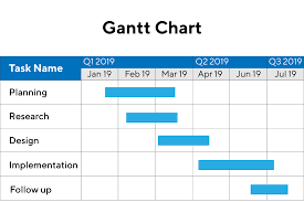
- Bar Charts: Ideal for comparing quantities across categories.
- Line Charts: Great for showing trends over time.
- Pie Charts: Useful for illustrating proportions or percentages.
- Scatter Plots: Show relationships between two variables.
The Impact of Visual Representation
Research has shown that visual data representation significantly enhances understanding and retention compared to textual information alone. When data is presented in a chart form, viewers can quickly interpret the information, identify patterns, outliers, and make informed decisions based on the insights gained from the visual representation.
Enhancing Communication
In addition to aiding comprehension, charts also facilitate effective communication. By presenting data visually, complex concepts can be simplified and communicated more clearly to a broader audience. Whether it’s sales figures, survey results, or scientific findings, charts help stakeholders grasp the key messages without getting lost in numbers and statistics.
The Art of Data Visualization
Crafting informative and visually appealing charts requires skill and creativity. Choosing the right type of chart to represent data accurately, selecting appropriate colours and fonts for clarity, and ensuring proper labelling are essential elements in creating impactful visualizations that resonate with viewers.
In Conclusion
In today’s data-driven world, charts have become indispensable tools for conveying information effectively across various fields. By harnessing the power of visual data representation through charts, we can unlock insights, drive decision-making processes, and communicate complex ideas with clarity and precision.
Nine Advantages of Using Charts for Effective Data Presentation
- Charts provide a visual representation of data, making complex information easier to understand at a glance.
- They help identify trends, patterns, and relationships within the data quickly and efficiently.
- Charts facilitate comparisons between different data sets or categories in a clear and concise manner.
- Visual charts enhance audience engagement and retention of key information compared to textual data alone.
- They are versatile tools that can be used across various industries and disciplines for data analysis and presentation.
- Charts aid decision-making processes by presenting insights in a visually compelling format that is easy to interpret.
- They simplify complex concepts and numerical data, making it accessible to a wider audience with varying levels of expertise.
- Charts can be customised with different styles, colours, and formats to suit specific communication needs and preferences.
- Using charts in presentations or reports adds professionalism and credibility to the information being conveyed.
Potential Pitfalls of Using Charts: Six Key Drawbacks
- Charts can oversimplify complex data, potentially leading to misinterpretation.
- Selecting the wrong type of chart for the data can distort the information being presented.
- Charts may not always accommodate all data points, resulting in a loss of granularity.
- Creating visually appealing charts requires time and effort, which may not always be feasible in fast-paced environments.
- Viewers with limited visual literacy may struggle to interpret charts accurately, leading to confusion.
- Over-reliance on charts can discourage critical thinking and deeper analysis of the underlying data.
Charts provide a visual representation of data, making complex information easier to understand at a glance.
Charts offer a valuable advantage by presenting data in a visual format, which simplifies the comprehension of intricate information with just a quick glance. This visual representation of data allows viewers to grasp complex concepts more easily, identify patterns, trends, and outliers effortlessly. By translating raw data into visually appealing charts, individuals can quickly interpret the significance of the information presented, enabling them to make informed decisions and draw meaningful insights promptly.
They help identify trends, patterns, and relationships within the data quickly and efficiently.
Charts serve as invaluable tools in data analysis by enabling the swift and efficient identification of trends, patterns, and relationships within the data. Through visual representation, charts offer a clear and concise way to highlight key insights that may not be immediately apparent when looking at raw data alone. By presenting information graphically, charts empower users to spot correlations, anomalies, and significant changes with ease, facilitating informed decision-making and strategic planning based on a deeper understanding of the underlying data dynamics.
Charts facilitate comparisons between different data sets or categories in a clear and concise manner.
One of the key advantages of using charts is their ability to facilitate comparisons between different data sets or categories in a clear and concise manner. By visually representing data through charts such as bar graphs or pie charts, viewers can easily discern patterns, trends, and variations across various datasets. This visual clarity not only simplifies the process of comparing information but also enables quick identification of relationships and differences, making it easier for decision-makers to draw meaningful insights and make informed choices based on the presented data.
Visual charts enhance audience engagement and retention of key information compared to textual data alone.
Visual charts offer a compelling advantage in enhancing audience engagement and improving retention of essential information when compared to presenting data solely in text format. By translating complex data into visually appealing charts, viewers are more likely to stay engaged and grasp key insights quickly. The visual representation of information not only captivates the audience’s attention but also aids in memory retention, making it easier for individuals to recall and understand the data presented. This pro of using charts underscores their effectiveness in conveying information efficiently and ensuring that key messages resonate with the audience long after the presentation has ended.
They are versatile tools that can be used across various industries and disciplines for data analysis and presentation.
Charts are versatile tools that transcend industry boundaries and disciplinary divides, offering a universal language for data analysis and presentation. From finance to healthcare, academia to marketing, charts serve as indispensable assets in visually representing complex data sets and patterns. Their adaptability allows professionals across diverse fields to harness the power of visual storytelling, enabling them to communicate insights, trends, and key findings with clarity and impact. Whether it’s tracking financial performance, monitoring patient outcomes, or analysing market trends, charts stand as versatile companions in the realm of data interpretation and presentation.
Charts aid decision-making processes by presenting insights in a visually compelling format that is easy to interpret.
Charts play a pivotal role in aiding decision-making processes by presenting valuable insights in a visually compelling format that is easy to interpret. By condensing complex data into clear and concise visual representations, charts empower decision-makers to quickly grasp trends, patterns, and relationships within the information presented. This visual clarity not only enhances understanding but also enables more informed and timely decisions to be made based on the insights derived from the chart, ultimately leading to more effective outcomes and strategies.
They simplify complex concepts and numerical data, making it accessible to a wider audience with varying levels of expertise.
Charts offer a significant advantage in simplifying intricate concepts and numerical data, thereby increasing accessibility to a diverse audience with varying levels of expertise. By visually representing complex information in a clear and intuitive manner, charts enable individuals to grasp key insights and trends quickly, regardless of their familiarity with the subject matter. This ability to streamline data presentation not only enhances understanding but also promotes effective communication, allowing a broader range of stakeholders to engage with and interpret the information presented.
Charts can be customised with different styles, colours, and formats to suit specific communication needs and preferences.
Charts offer a versatile advantage in that they can be customised with a variety of styles, colours, and formats to cater to specific communication needs and preferences. This flexibility allows users to tailor their charts to align with branding guidelines, enhance visual appeal, and convey information in a way that resonates most effectively with their target audience. By customising charts, individuals and organisations can create visually engaging representations of data that not only inform but also captivate viewers, making the communication process more impactful and memorable.
Using charts in presentations or reports adds professionalism and credibility to the information being conveyed.
Utilising charts in presentations or reports enhances the professionalism and credibility of the information being communicated. By incorporating visual representations of data, such as bar graphs, pie charts, or line graphs, presenters can demonstrate a structured and organised approach to conveying complex information. Charts not only make data more accessible and easier to understand for the audience but also lend an air of authority and expertise to the content being presented. This visual aid not only reinforces key points but also instils confidence in the accuracy and reliability of the information shared, thereby elevating the overall impact and effectiveness of the presentation or report.
Charts can oversimplify complex data, potentially leading to misinterpretation.
Charts, while effective in presenting data visually, have a notable downside: they can oversimplify complex information, which may result in misinterpretation. By condensing intricate datasets into simplified visual representations, charts run the risk of omitting crucial nuances and context that are essential for a comprehensive understanding of the data. This oversimplification can lead to erroneous conclusions or misinterpretations if viewers fail to consider the full complexity of the underlying information. It is crucial to exercise caution when relying solely on charts for data analysis and to complement visual representations with detailed explanations to ensure accurate interpretation.
Selecting the wrong type of chart for the data can distort the information being presented.
Choosing the incorrect type of chart for the data at hand can lead to distortion and misinterpretation of the information being conveyed. Using a chart that does not align with the nature of the data can obscure key insights, misrepresent relationships, and ultimately undermine the effectiveness of the visual representation. It is essential to carefully consider the characteristics of the data set and select an appropriate chart type that accurately reflects the underlying patterns and trends to ensure that the message is communicated clearly and accurately to the audience.
Charts may not always accommodate all data points, resulting in a loss of granularity.
Charts, while effective in visually representing data trends and patterns, may encounter limitations when it comes to accommodating all data points. This can lead to a loss of granularity, where detailed information or outliers may not be adequately captured or displayed in the chart format. As a result, viewers may miss out on specific data points that could provide valuable insights or context to the overall dataset. It is important to be mindful of this limitation and consider alternative ways to present detailed information alongside charts to ensure a comprehensive understanding of the data being conveyed.
Creating visually appealing charts requires time and effort, which may not always be feasible in fast-paced environments.
In fast-paced environments, the time and effort required to create visually appealing charts can be a significant drawback. With tight deadlines and constant pressure to deliver results quickly, dedicating the necessary time to design aesthetically pleasing charts may not always be feasible. This limitation can lead to rushed or subpar visual representations of data, potentially compromising the clarity and effectiveness of the message being conveyed. Balancing the need for speed with the desire for visually engaging charts poses a challenge in environments where time is of the essence.
Viewers with limited visual literacy may struggle to interpret charts accurately, leading to confusion.
Viewers with limited visual literacy may encounter challenges when interpreting charts, potentially leading to confusion and misinterpretation of the data presented. Without a solid understanding of chart types, scales, and data representation principles, individuals may struggle to extract meaningful insights from the visual information. This lack of visual literacy can hinder effective communication and decision-making, as viewers may misinterpret trends or relationships within the data. To address this con, it is essential to provide clear explanations, legends, and context alongside charts to support viewers in accurately interpreting the visual data presented.
Over-reliance on charts can discourage critical thinking and deeper analysis of the underlying data.
Over-reliance on charts can inadvertently hinder critical thinking and deeper analysis of the underlying data. While charts provide a quick visual summary of information, solely relying on them may lead to a superficial understanding of the data without delving into the nuances and complexities that lie beneath the surface. It is essential to complement chart interpretations with thorough scrutiny of the raw data, considering contextual factors, and questioning assumptions to ensure a more comprehensive and accurate analysis. Balancing the convenience of charts with a critical examination of the data is crucial in fostering a deeper understanding and making informed decisions based on robust insights.