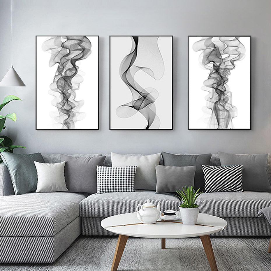
Black and White Prints for the Living Room
Black and white prints are a timeless way to bring character to a living room. Their simple palette works with a wide range of interiors, from sleek and contemporary spaces to relaxed, traditional homes. Whether you choose a single statement piece or create a gallery wall, monochrome artwork can add contrast, focus and personality without competing with the rest of your décor.
Why choose black and white wall art?
Without colour to dominate the image, attention naturally turns to its subject, shape and texture. A striking photograph, graphic illustration or expressive line drawing can make an impact while keeping the overall look calm and balanced. Black and white prints are also easy to coordinate with existing furniture, fabrics and accessories, making them a flexible choice if you like to update your room over time.
Find a style that suits your space
The right print should feel at home with the atmosphere you want to create. Consider the room’s existing shapes, materials and mood when choosing artwork.
- Photography: Architectural images, portraits, landscapes and street photography can add depth and tell a story.
- Abstract art: Bold shapes and expressive marks bring movement and a more contemporary feel.
- Line drawings: Simple, elegant illustrations suit relaxed, minimal or Scandinavian-inspired interiors.
- Typography: Words and letterforms can introduce a personal touch, especially when chosen thoughtfully.
Choose the right size and placement
A print should feel in proportion to the wall and the furniture around it. A large piece can anchor a room above a sofa, while a smaller print may work well on a narrow wall or as part of a collection. When hanging artwork above furniture, leave enough space between the top of the furniture and the bottom of the frame so the arrangement feels connected without appearing cramped.
Before putting nails in the wall, try arranging paper templates in the intended sizes. This makes it easier to compare layouts and find the right position. For a single print, aim to hang it at a comfortable viewing height, taking the room’s furniture and sightlines into account.
Create a monochrome gallery wall
A gallery wall lets you combine different subjects and formats while keeping a cohesive look. For a tidy arrangement, use frames of the same colour and keep the gaps between them consistent. For a more collected feel, mix frame styles or sizes, but repeat one or two elements—such as black frames, white mounts or a shared theme—to tie the display together.
Lay the prints out on the floor first, or use paper templates on the wall to test the composition. A balanced gallery wall does not have to be perfectly symmetrical; it simply needs a pleasing distribution of visual weight.
Think about frames and finishes
Black frames create a crisp outline and can emphasise the contrast in the artwork. White frames offer a lighter, softer look, while natural wood can bring warmth to a monochrome scheme. A mount around the print adds breathing space and can help a smaller image feel more substantial.
Consider the finish of the print, too. A matte surface tends to reduce glare and offers a subtle, understated appearance. A glossier finish may make details feel more pronounced, though it can reflect light from windows and lamps.
Balance contrast with texture
Black and white prints work particularly well alongside tactile furnishings. Cushions, rugs, curtains and upholstery in varied textures can stop a monochrome scheme from feeling flat. You might also introduce small touches of colour through plants, ceramics or a favourite throw. These accents can complement the artwork without taking attention away from it.
Make the room feel personal
The most successful living-room art reflects the people who use the space. Choose images you enjoy looking at, whether they remind you of a place, explore a subject you love or simply make you pause. With thoughtful placement and a frame that suits your interior, black and white prints can bring lasting style and a distinctly personal feel to your living room.
7 Reasons Why Black and White Prints Enhance Your Living Room Décor
- Timeless style that suits many interiors.
- Easy to coordinate with existing décor.
- Adds contrast without overwhelming the room.
- Creates a calm, cohesive look.
- Works beautifully in gallery walls.
- Highlights shape, detail and texture.
- Makes a striking focal point.
Considerations for Black and White Prints: Potential Drawbacks in Living Room Decor
- Can make a room feel stark or cold.
- Dust and marks show easily on dark frames.
- May feel less lively than colourful artwork.
- Glare can obscure prints behind glass.
Timeless style that suits many interiors.
Black and white prints bring a timeless style to the living room, working just as well in contemporary spaces as in more traditional interiors. Their neutral palette sits comfortably alongside different colours, materials and furniture styles, so they’re easy to keep as your décor evolves.
Easy to coordinate with existing décor.
Black and white prints are easy to coordinate with existing décor because their neutral palette complements almost any colour scheme. Whether your living room features bold accents, soft neutrals or natural materials, monochrome artwork can sit comfortably alongside them without clashing. This makes it simple to refresh your walls while keeping the room feeling balanced and cohesive.
Adds contrast without overwhelming the room.
Black and white prints add contrast to a living room without overwhelming it with colour. Their clear tones draw the eye and help define a wall or seating area, while their restrained palette sits comfortably alongside existing furnishings, patterns and décor.
Creates a calm, cohesive look.
Black and white prints can create a calm, cohesive look in your living room because their limited palette brings visual harmony to the space. They’re easy to pair with different colours, furnishings and textures, helping the room feel thoughtfully put together without making it look busy.
Works beautifully in gallery walls.
Black and white prints work beautifully in gallery walls, bringing together different images and styles with a consistent, cohesive look. Mix photographs, illustrations and graphic designs in a range of sizes, then use matching frames or mounts to tie the arrangement together. The monochrome palette keeps the display visually balanced, while each print still has room to stand out.
Highlights shape, detail and texture.
Black and white prints draw attention to the shapes, details and textures within an image. Without colour to distract the eye, the contrast between light and dark can make architectural lines, fine patterns and subtle surface details stand out. This gives your living room artwork depth and visual interest, while keeping the overall look calm and timeless.
Makes a striking focal point.
Black and white prints can make a striking focal point in your living room. Their strong contrast naturally draws the eye, helping a favourite photograph, illustration or abstract design stand out against the surrounding décor. Place a larger print above the sofa or fireplace to anchor the room, or group smaller pieces together to create an eye-catching gallery wall.
Can make a room feel stark or cold.
Black and white prints can sometimes make a living room feel stark or cold, particularly when paired with a minimalist colour scheme, hard surfaces and little soft furnishing. Strong contrasts may create a formal feel rather than a cosy one. To soften the look, choose prints with gentle tones or organic subjects, and balance them with warm lighting, natural materials, textured cushions and touches of colour.
Dust and marks show easily on dark frames.
Dark frames can look striking around black and white prints, but dust, fingerprints and small marks may be more noticeable on their surfaces, particularly in bright light. Regular gentle dusting and careful handling will help keep them looking their best.
May feel less lively than colourful artwork.
Black and white prints can sometimes feel less lively than colourful artwork, particularly in a room that already uses a restrained palette. Without bright hues to add energy, a monochrome display may seem subdued or stark. To soften the effect, pair the prints with warm lighting, textured furnishings, natural materials or a few carefully chosen colour accents.
Glare can obscure prints behind glass.
One potential drawback of black and white prints is glare from the glass, which can make the artwork difficult to see, particularly when it catches light from windows or lamps. This may obscure fine details and reduce the impact of the image. To minimise reflections, hang prints away from direct light, use non-reflective glass, or choose a matte finish.