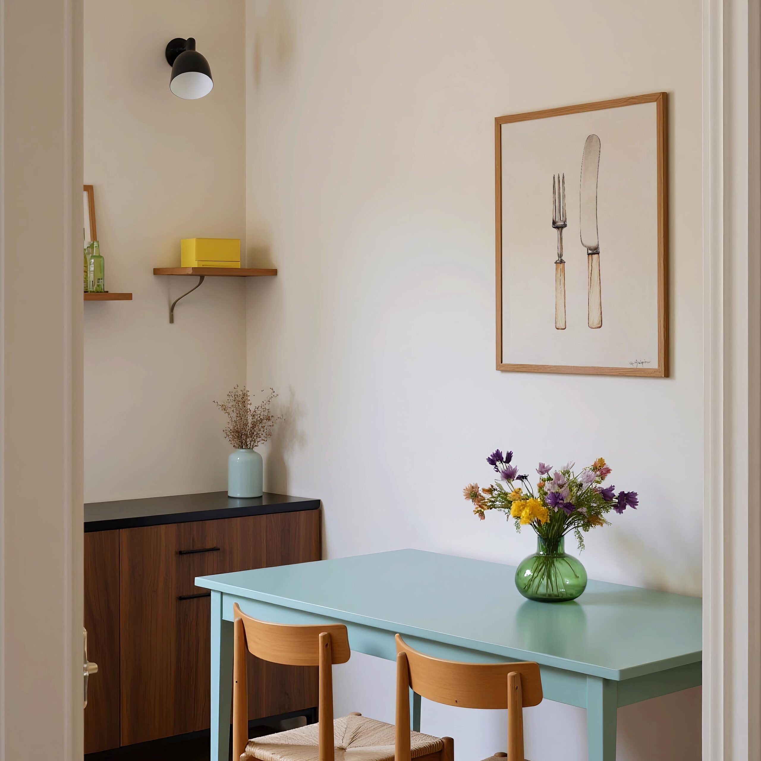
Vintage Kitchen Prints: Timeless Style for the Heart of the Home
Vintage kitchen prints bring warmth, character and a little nostalgia to one of the busiest rooms in the house. From colourful fruit illustrations to old-fashioned adverts and botanical drawings, these prints can make a kitchen feel personal without the need for a full renovation. Whether your home is sleek and modern or full of rustic charm, the right artwork can add a distinctive finishing touch.
What Makes a Print Feel Vintage?
Vintage-style kitchen prints take inspiration from designs and printing techniques of the past. Popular subjects include hand-drawn vegetables, herbs, flowers, coffee and tea, baking, and traditional kitchen equipment. Some designs imitate vintage packaging or advertising, while others resemble pages from old cookbooks and botanical guides.
Colour and finish play a big part in the look. Muted greens, soft reds, cream backgrounds and faded blues can suggest age, while slightly distressed textures give a print a well-loved appearance. Not every vintage-inspired design needs to look faded, though: bold mid-century colours and crisp graphic shapes can feel just as nostalgic.
Choosing the Right Kitchen Prints
Start by thinking about the atmosphere you want to create. A set of botanical herb illustrations can bring a calm, country-inspired feel, while retro food adverts add colour and a playful note. For a more understated look, choose simple line drawings or vintage-style typography in a limited palette.
It helps to consider the colours already in your kitchen. Prints can pick out a shade from your tiles, cupboards or accessories, helping the room feel coordinated. Alternatively, a contrasting colour can turn a small artwork into a focal point.
Size matters, too. A single large print can make a statement above a breakfast table or on an open wall. Smaller prints work well as a group, especially when they share a subject, colour scheme or frame style. Before hanging anything, arrange the prints on the floor or make paper templates to test the layout.
Ways to Display Vintage Kitchen Prints
A gallery wall is an easy way to combine different designs. Try mixing food illustrations with old-fashioned adverts, recipe-inspired prints and botanical studies. A consistent frame colour will keep the display looking pulled together, while a mix of frame styles can create a more collected, relaxed effect.
For a simpler arrangement, lean framed prints on a shelf or worktop. This makes it easy to swap them around and refresh the display. Just make sure they are positioned safely away from heat, splashes and busy preparation areas.
Frames can shape the overall look. Natural wood suits rustic and cottage-style kitchens, while slim black frames give vintage artwork a sharper, more contemporary edge. Unframed prints can also work well when clipped to a board or displayed in a simple poster hanger.
Practical Tips for Kitchen Artwork
Kitchens can be humid, warm and prone to splashes, so placement is important. Hang prints away from the cooker, sink and areas where steam gathers. A glazed frame offers some protection from dust and everyday marks; for extra peace of mind, choose a print on a material designed to cope with moisture.
If you are displaying valuable original artwork or older paper prints, avoid direct sunlight, which can cause colours to fade. Use suitable backing and framing materials, and consider placing delicate pieces in a cooler, drier part of the room.
A Simple Way to Add Character
Vintage kitchen prints can tell a story about the way you cook, eat and enjoy your home. A favourite fruit, a much-loved café style or an illustration of garden herbs can make the room feel more individual. Start with one print that catches your eye, then build a collection over time. With a little thought about colour, scale and placement, vintage-inspired artwork can bring enduring charm to the heart of your home.
6 Tips for Choosing and Displaying Vintage Kitchen Prints
- Choose prints that complement your kitchen colours.
- Look for clear details and vibrant, unfaded inks.
- Mix different sizes for a relaxed gallery wall.
- Use simple frames to let the artwork shine.
- Keep prints away from steam and direct sunlight.
- Check the paper for tears, stains and foxing.
Choose prints that complement your kitchen colours.
Choose vintage kitchen prints that complement the colours already in your kitchen to create a harmonious, well-considered look. Pick out a shade from your cupboards, tiles or accessories, or use a print with a contrasting colour to add a cheerful focal point. Muted tones suit a softer, traditional feel, while brighter hues can bring a playful retro touch.
Look for clear details and vibrant, unfaded inks.
When choosing vintage kitchen prints, look for crisp details and vibrant, unfaded inks. Clear lines and rich colours can indicate that a print has been well preserved, while also helping its artwork stand out on your wall. Check the paper for signs of fading or damage, especially around the edges, and remember that a little age-related wear can add character without obscuring the design.
Mix different sizes for a relaxed gallery wall.
Mixing different print sizes is an easy way to create a relaxed, collected gallery wall in your kitchen. Pair a larger vintage food illustration with smaller botanical prints or retro adverts, and let the arrangement feel a little informal rather than perfectly symmetrical. For a balanced look, repeat colours or themes across the prints, and lay them out on the floor first to find a grouping that feels right.
Use simple frames to let the artwork shine.
Choose simple frames to let vintage kitchen prints take centre stage. Slim wooden or understated black frames complement the artwork without competing with its colours, details or nostalgic charm. Keeping the frame style consistent can also help a collection of different prints feel cohesive.
Keep prints away from steam and direct sunlight.
To keep vintage kitchen prints looking their best, hang them away from steam and direct sunlight. Excess moisture can cause paper to warp or become damaged, while sunlight may gradually fade the colours. Choose a cooler, drier spot in the kitchen, and consider framing prints behind glass for added protection.
Check the paper for tears, stains and foxing.
Before buying a vintage kitchen print, check the paper carefully for tears, stains and foxing—the small brown spots that can develop with age and damp. Inspect the edges and corners, as well as the area around the image, and look for any discolouration or repairs. Minor signs of age can add character, but more serious damage may affect the print’s appearance, value and preservation.