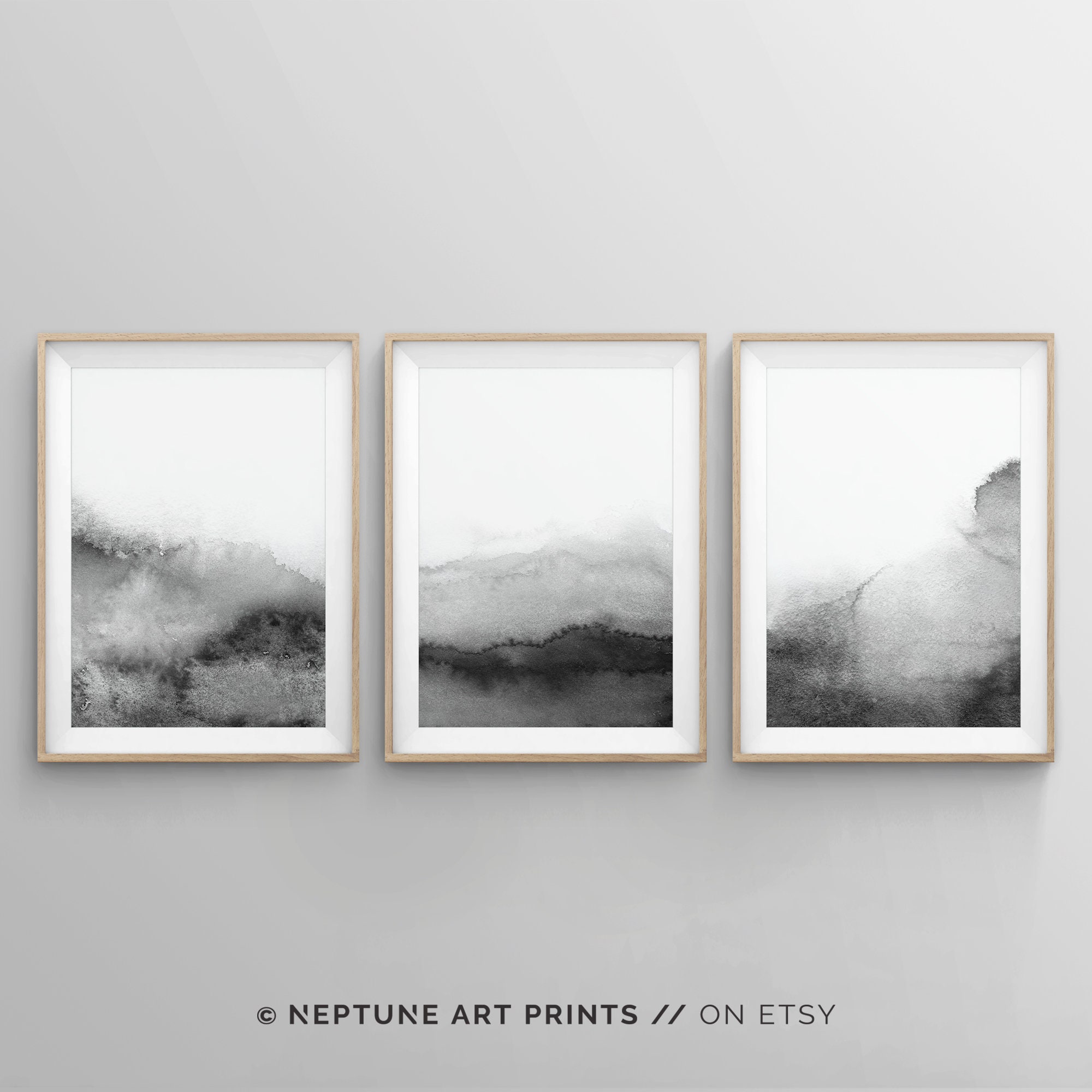
Black and White Abstract Prints: Timeless Art for Every Space
Black and white abstract prints bring contrast, character and a sense of balance to a room. With no colour palette to dictate the mood, their appeal comes from shape, line, texture and composition. From bold geometric forms to fluid brushstrokes, these prints can make a striking focal point or sit quietly alongside the rest of your décor.
Why choose black and white?
A monochrome palette is versatile and enduring. Black creates definition, while white gives a design space to breathe. Together, they can feel graphic and dramatic, calm and minimal, or somewhere in between. Abstract artwork also leaves room for interpretation: viewers can respond to its movement, patterns and mood in their own way.
Because black and white prints work with so many colours, they are easy to incorporate into changing interiors. They can complement neutral schemes, sharpen a colourful room or bring cohesion to a collection of objects and furnishings.
Find a style that suits your space
Abstract art takes many forms. Consider the overall feel you want to create when choosing a print:
- Geometric designs use clear shapes and structured lines for a crisp, contemporary look.
- Gestural brushwork adds energy and movement, with marks that feel expressive and spontaneous.
- Minimal compositions make use of negative space and a few carefully placed elements for a quieter effect.
- Textured or layered designs bring visual depth and can add interest to a simple interior.
- Organic forms offer softer curves and irregular shapes that can balance angular furniture and architecture.
Choosing the right size and placement
The scale of a print can change how a room feels. A large piece can anchor a wall above a sofa, bed or console table, while a smaller print may work well on a shelf or as part of a gallery wall. Before buying, measure the available space and consider how the artwork will relate to nearby furniture.
For a balanced arrangement, leave enough space around the print so that it does not feel crowded. If you are hanging several works together, lay out the arrangement on the floor first. A consistent frame style can make a group feel unified, while a mix of frame finishes can create a more collected look.
Make monochrome art your own
Black and white prints do not have to make a room feel stark. Natural materials such as wood, linen and wool can soften their contrast, while plants introduce a fresh note. Alternatively, use the artwork to reinforce a graphic scheme with clean lines, dark accents and simple furnishings.
Framing also affects the final impression. A slim black frame can emphasise the print’s contrast, while a pale wood frame may give it a more relaxed feel. For a clean, gallery-inspired finish, consider a white mount; for greater impact, choose a closer crop or a frame that follows the artwork’s edges.
A lasting addition to your home
Whether you prefer bold marks or restrained shapes, black and white abstract prints offer an adaptable way to bring art into your home. Choose a design that resonates with you, give it room to be seen and let its forms add a distinctive note to your space.
9 Tips for Enhancing Your Space with Black and White Abstract Prints
- Use black and white prints to add contrast to a room.
- Pair bold abstracts with simple, neutral furniture.
- Mix different patterns while keeping a consistent palette.
- Choose a print size that suits the wall space.
- Hang prints at eye level for a balanced display.
- Use matching frames for a tidy gallery wall.
- Combine geometric designs with softer organic forms.
- Leave space around each print to avoid visual clutter.
- Try a monochrome print to make a subtle statement.
Use black and white prints to add contrast to a room.
Use black and white abstract prints to add contrast and visual interest to a room. Their crisp tones can stand out against pale walls or balance colourful furnishings, while bold shapes and expressive lines draw the eye without overwhelming the space. For a cohesive look, echo the print’s black or white tones in smaller details such as cushions, frames or lamps.
Pair bold abstracts with simple, neutral furniture.
Pair bold black and white abstract prints with simple, neutral furniture to let the artwork take centre stage. Clean lines and soft tones create a calm backdrop for striking shapes and contrasts, helping the print make an impact without making the room feel busy.
Mix different patterns while keeping a consistent palette.
Mixing different patterns can add depth and personality to a room, while a consistent black and white palette keeps the overall look balanced. Pair bold geometric prints with softer, more organic designs, varying their scale so each piece has space to stand out. Repeating black and white across the artwork and accessories will tie everything together without making the mix feel busy.
Choose a print size that suits the wall space.
Choose a print size that suits the wall space to create a balanced display. A large print can make a striking focal point on a spacious, uncluttered wall, while a smaller design may be better suited to a narrow area or a cosy room. Before choosing, measure the wall and consider the furniture nearby, leaving enough space around the artwork so it feels intentional rather than cramped.
Hang prints at eye level for a balanced display.
Hang black and white abstract prints at eye level to create a balanced, comfortable display. As a guide, position the centre of the artwork around 145–155 cm from the floor, adjusting for your room and viewing position. If hanging a print above furniture, leave enough space between the two so the arrangement feels connected without appearing cramped.
Use matching frames for a tidy gallery wall.
Use matching frames to give a gallery wall a tidy, cohesive feel. A consistent frame style helps different black and white abstract prints sit together as a considered collection, even when their shapes and compositions vary. Choose a finish that complements your room, then keep the spacing between frames even for a neat, balanced display.
Combine geometric designs with softer organic forms.
Pairing geometric designs with softer organic forms creates an appealing balance in a black and white abstract print. Clean lines and structured shapes bring definition, while flowing curves and irregular forms add warmth and movement. This contrast keeps the composition visually engaging without relying on colour, and works particularly well in interiors that mix modern furniture with natural textures.
Leave space around each print to avoid visual clutter.
Leave space around each black and white abstract print so its shapes and contrasts can stand out. Giving each piece room to breathe helps avoid visual clutter and creates a calmer, more balanced display, whether you’re hanging a single statement print or arranging a gallery wall.
Try a monochrome print to make a subtle statement.
Try a monochrome print to make a subtle statement. Its restrained palette adds contrast and visual interest without overwhelming the room, while abstract shapes bring texture and movement. Choose a design that complements your space, or let a bold composition stand out against a simple background.